In today’s data-driven world, the ability to analyze survey data efficiently is crucial for making informed decisions. Microsoft Excel’s PivotTables and Charts offer a powerful combination to help you transform raw data into meaningful insights. This guide will walk you through the process of analyzing survey data with MS Excel, showcasing techniques, best practices, and real-world applications.
Analyzing Survey Data with MS Excel: PivotTables and Charts
Survey data analysis can be daunting, but MS Excel’s PivotTables and Charts provide a user-friendly interface to dive into your data. This section delves into the fundamentals of using PivotTables and Charts for effective data analysis.
Getting Started with PivotTables
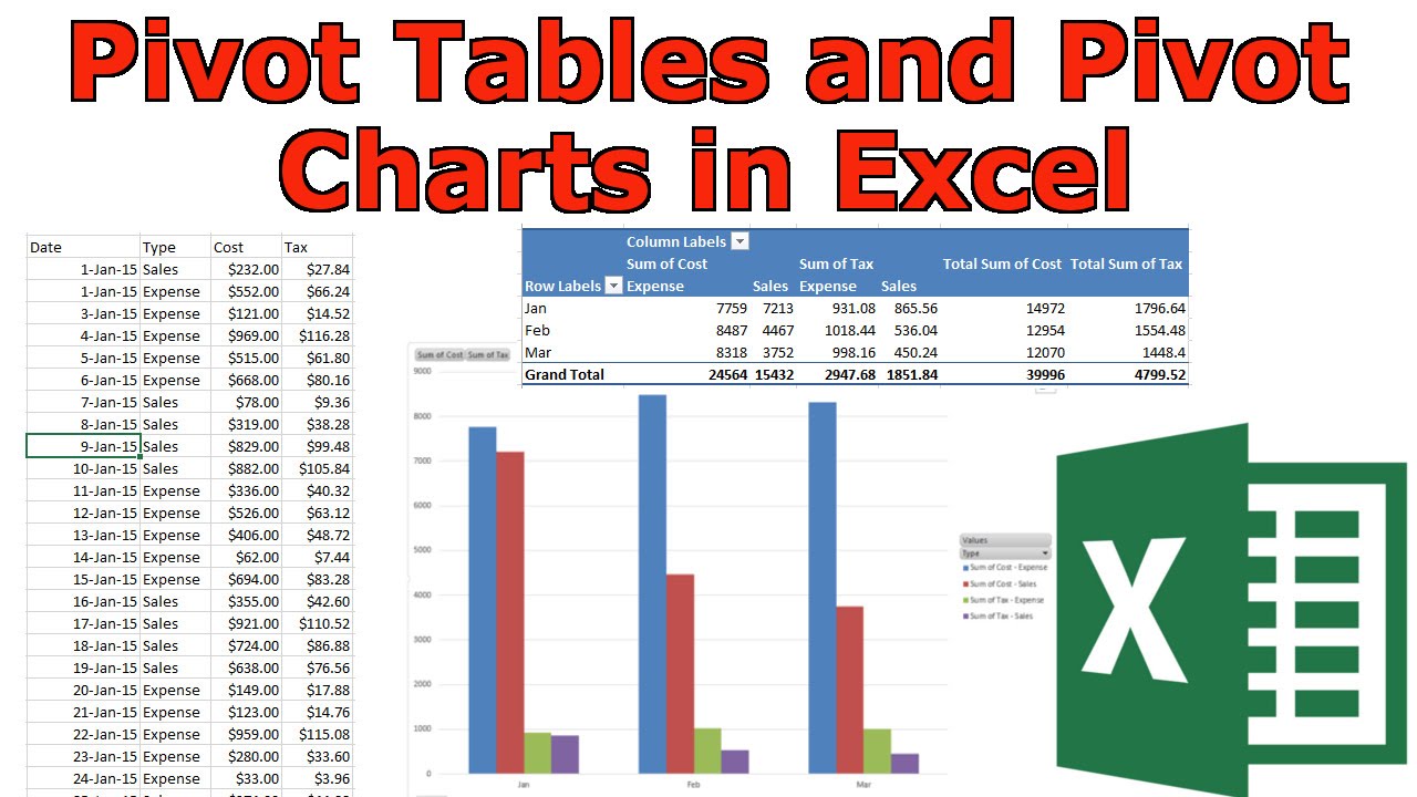
To start your survey data analysis journey, open Excel and import your survey data. Head to the “Insert” tab, select “PivotTable,” and choose the relevant data range. PivotTables allow you to summarize and manipulate data dynamically, making it easier to identify trends and patterns.
Steps to Get Started with PivotTables
| Step | Action | Description |
|---|---|---|
| 1 | Open Excel | Launch Microsoft Excel on your computer. |
| 2 | Import Survey Data | Locate and open the spreadsheet containing your survey data. |
| 3 | Navigate to “Insert” Tab | Click on the “Insert” tab in the Excel ribbon. |
| 4 | Select “PivotTable” | From the “Tables” group, choose “PivotTable.” |
| 5 | Choose Data Range | In the “Create PivotTable” dialog, specify the data range you want to analyze. |
| 6 | Create PivotTable | Click “OK” to create a new PivotTable. |
| 7 | Design Your PivotTable | Drag survey questions to rows and columns to organize data. Use filters for precision. |
| 8 | Utilize PivotTable Filters | Apply filters to narrow down data based on criteria like demographics or responses. |
| 9 | Enhance with PivotCharts | Create PivotCharts to visualize data using various chart types. Customize visuals for clarity. |
| 10 | Extract Insights | Analyze trends, patterns, and outliers in your data. Use insights to make informed decisions. |
Organizing Data in PivotTables
With your data imported, it’s time to organize it effectively. Drag survey questions into rows and columns to create a clear structure. For instance, if you’re analyzing customer feedback, you could organize data by product or service. Utilize filters to focus on specific subsets of data, enhancing the precision of your analysis.
Utilizing PivotTable Filters for Precise Analysis
PivotTable filters empower you to narrow down your analysis based on different criteria. Whether it’s demographics, time periods, or specific responses, filters enable you to extract targeted insights. This feature is invaluable for segmenting data and uncovering hidden correlations.
Creating Compelling PivotCharts
In today’s data-driven world, the ability to analyze survey data efficiently is crucial for making informed decisions. Microsoft Excel’s PivotTables and Charts offer a powerful combination to help you transform raw data into meaningful insights. This guide will walk you through the process of analyzing survey data with MS Excel, showcasing techniques, best practices, and real-world applications.
- Choose Chart Types: MS Excel offers a variety of chart types such as bar graphs, line charts, and pie charts. Consider the nature of your data and the insights you want to convey when selecting a chart type.
- Illustrate Findings: Use PivotCharts to illustrate key findings from your data analysis. Bar graphs are great for comparing data across categories, line charts show trends over time, and pie charts depict proportions.
- Customize Colors and Styles: Customize the appearance of your PivotCharts to match your brand or enhance clarity. Choose colors that are easy to distinguish, and add labels and data markers to provide context.
- Add Titles and Labels: A well-crafted title and clear labels enhance the understanding of your PivotCharts. Ensure titles are descriptive and convey the main message, while labels provide context to data points.
- Highlight Key Points: Use colors, shading, or annotations to highlight significant data points or trends. This draws the viewer’s attention to the most relevant information.
Examples of PivotChart Customization
| Aspect | Customization Tips |
|---|---|
| Colors | Select a color palette that aligns with your brand or data visualization needs. |
| Labels and Titles | Craft descriptive titles and labels that provide context and insights. |
| Data Markers | Use data markers like data points, lines, or bars to aid in data interpretation. |
| Annotations | Add text annotations to draw attention to specific data points or trends. |
Crafting Data-Driven Visuals
Visual representation enhances data comprehension. MS Excel’s Chart tools offer flexibility to customize visuals, such as adjusting axes, adding data labels, and highlighting key points. These visual aids make your survey data more engaging and accessible.
Extracting Actionable Insights
As you delve into your survey data using PivotTables and Charts, keep an eye out for recurring trends, outliers, and notable patterns. These insights can drive decision-making, influence strategies, and guide improvements. For instance, identifying a common customer pain point can lead to targeted solutions.
Real-World Application: Market Research
PivotTables and Charts are not limited to specific industries. Let’s consider a market research scenario. By analyzing survey responses about consumer preferences, a business can adjust its product offerings, tailor marketing campaigns, and gain a competitive edge.
Tips for Effective Survey Data Analysis
- Stay Organized: Properly structure your data to ease analysis.
- Use Descriptive Labels: Employ clear labels for columns and rows to prevent confusion.
- Regular Updates: Keep your analysis up-to-date with fresh survey data.
FAQs
Q: Can I use PivotTables for qualitative data analysis?
A: PivotTables are better suited for quantitative data analysis. They can summarize, group, and filter data, making them ideal for numerical insights.
Q: How can I avoid errors in my analysis?
A: Double-check data input and formulas. Utilize Excel’s data validation tools to minimize errors.
Q: Is it possible to create interactive dashboards?
A: Absolutely! PivotTables and Charts can be combined to create dynamic dashboards for interactive data exploration.
Q: Can I analyze data from external sources?
A: Yes, Excel allows data import from various sources like CSV files, databases, and online surveys.
Q: Are there alternatives to PivotTables?
A: Yes, tools like Power BI and Tableau offer advanced data visualization features for in-depth analysis.
Q: How often should I update my analysis?
A: It depends on your data source and business needs. Regular updates, such as weekly or monthly, are common.
Analyzing survey data with MS Excel’s PivotTables and Charts empowers individuals and businesses to make informed decisions. By following the techniques outlined in this guide, you can transform raw survey data into actionable insights, paving the way for improved strategies, enhanced customer experiences, and overall success.